IMG_5383
Originally uploaded by reallyct
Once upon a time, in our old apartment, we decided we would spruce things up a bit by painting some accent walls. I took the fun trip to Home Depot and loaded up on paint chips that I then pasted to the wall. Devoted partner might claim this was a pretense as I already knew what colors I wanted, and in point of fact the two walls did end up those colors, but had a convincing counter-argument been made, I may well have given it its due. The colors I was looking to match were bordello red and tropical paradise blue. Both were easy to narrow down and find and I would use both colors again (though in all honesty, I forget the name of the blue we used).
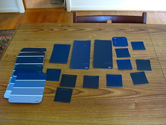
So now that I have a project, I skipped to the Home Depot to pick out my navy-ish color.
There were way more choices than I expected, and frankly than I think are strictly necessary. Yeah, I brought them all home because maybe devoted partner could see something I didn't. Yes, well, devoted partner took one look at this hot decorating mess and asked if I was joking. He may have a point: there certainly are a number of virtually indistinguishable choices.
So, I guess, dear Amy and others who like to weigh in, should we be looking at the slate dark blues, the royal dark blues, or the violet dark blues? I feel a bit or vertigo even staring at this picture for too long. I'm ready to get my hands (and clothing, and hair) dirty, I just need a little more direction!

First, I'd recommend not buying paint from Home Depot, but from a paint store. Benjamin Moore is terrific paint. Actually, if you wanted to spend $55 per gallon on really awesome paint, there is a Farrow and Ball in Greenwich, last I checked-- but since you're renting, that might be kind of extravagant.
ReplyDeleteSecond tip: spend the extra few dollars for the higher-quality paint mix. It covers better, so the extra money is worth fewer coats and touch-ups.
Gosh, this is tough without seeing the room, the chips, the way the chips look in the room, the table, etc. But, I'm so flattered by the copious and public references to my expertise, I feel obligated to offer an opinion. First, I'd say semi-gloss (which is shinier than eggshell, but not so shiny as gloss). Second, in my mind's eye I saw a royal dark blue. This is pretty worthless, considering it's via camera, via digital image, via my monitor, but I like the first column on the left of the single-color chips. Let me know what you decide! xx
ReplyDeleteFun! I would go as dark as possible. We have this amazing little room that I use as my study and it is a super dark green (including ceiling) and is so cozy. In our new place, we are painting our library a very dark purple/eggplant. I think dark and dramatic is intriguing and glamorous...
ReplyDeleteThank you ladies! I realize that it is pretty worthless given the photo, but if you choose to believe me, it's just as confusing in person.
ReplyDeleteNow Sophie, let's not get carried away - do you know how many pudding cups a person can buy for $55? I do. I recently invested in like 100 sugar free pudding cups to assist us in becoming less rotund - if you close your eyes it almost tastes like...no, it doesn't, it tastes like sugar free pudding.
Ames, I think you might be on to something. As I look at the photo I am coming to like the bottom left single paint chip - I must see what it looks like in person when I get home.
And Aidan, I love the color you describe - thinking about it is making me want to go paint something that color, but I don't have any ready project. Sigh. It's an awesome color for a library. Please post pictures as it comes along!